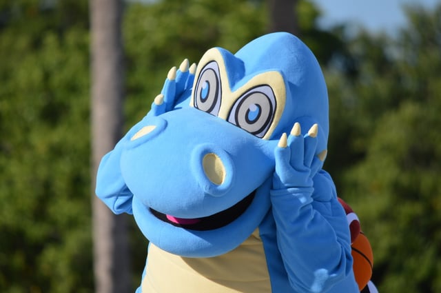
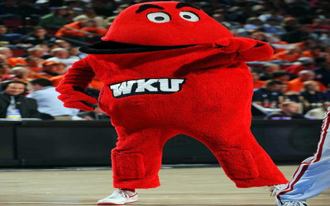
Alright, let’s talk about something I’ve been noticing more and more lately – just plain bad mascots. You see them everywhere once you start looking.

My Process of Noticing
It really started clicking for me a few weeks back. I was just browsing, minding my own business, and I kept seeing these… characters. Attached to brands, services, you name it. And some of them were just awful. Not just poorly drawn, but genuinely off-putting or confusing.
So, I started paying more attention. Made it a sort of mental exercise, I guess. When I saw a new mascot, I’d stop and think: does this work? Why or why not? Most of the time, especially with the bad ones, the answer was a big ‘nope’.
I began mentally cataloging the types of bad mascots I was encountering. It wasn’t like I was doing formal research, just observations from day-to-day life, things I saw online, on packaging, even local businesses.
What Makes Them Bad (In My Experience)
Here’s the kind of stuff I noticed consistently popping up with the bad ones:
- The Creepy Factor: Some mascots just look unsettling. Like, the eyes are weird, the smile is forced, or the proportions are all wrong. Instead of making you feel good about the brand, they just make your skin crawl a bit. I saw one for a tech company, looked like a weirdly smooth, dead-eyed blob trying to look friendly. Total fail.
- The “Huh?” Factor: Then there are the ones where you have absolutely no idea what they are supposed to be or what they have to do with the product. A weird geometric shape for a bakery? A bizarre, multi-limbed creature for insurance? It just leaves you confused, not engaged. It doesn’t connect.
- Trying Too Hard: You can almost feel the desperation with some mascots. They’re loaded with “cool” accessories, maybe sunglasses or a skateboard, trying to appeal to a demographic they clearly don’t understand. It feels forced and inauthentic. I remember seeing one for some kind of healthy snack, it was like a fruit trying to be a hip-hop star. Just embarrassing.
- Just Plain Ugly: Sometimes, it’s simple. The design is just bad. Poor color choices, awkward lines, looks like it was drawn in five minutes by someone who didn’t care. No amount of strategy can save a mascot that’s just fundamentally unappealing to look at.
Figuring Out the ‘Why’
So, going through this process of spotting and mentally sorting these bad mascots, I started to think about why they fail. It often boils down to a few things, from what I can tell.

Lack of clarity is a big one. If people don’t get it, it’s failed. Lack of connection to the actual product or service is another. It feels random. And sometimes, it’s a lack of basic aesthetic appeal. They just don’t look good.
It seems like whoever created them didn’t really think about the audience’s gut reaction. They were probably stuck in a meeting room somewhere, overthinking it, instead of considering how a real person would feel when they saw this thing out in the wild.
End Result of My Observation
My takeaway from just observing all these bad attempts? A mascot should be simple, appealing (or at least not actively disappealing), and clearly linked to what it represents. When brands get it wrong, it doesn’t just not help; it can actually hurt. It makes them look out of touch, unprofessional, or just plain weird.
Anyway, that’s just what I’ve been seeing and thinking about. It’s funny the things you notice when you start paying attention. Just a little record of my observations on the strange world of bad mascots.


